 I finished The Tenant of Wildfell Hall and enjoyed it inordinately. I have now traveled the Brontë trinity from A to E and hope to read Villette (C) and Agnes Grey (A) this year, too.
In looking at my own volumes of Brontë books and those on Amazon etc. my only disappointment is the very unimaginative book covers the Brontë books are slapped with. About 85% of the time it’s a dim 18th century painting of a woman in a cloak or voluminous dark dress. I’ve also seen a couple goth cartoonish covers, and some that look like Harlequin Romances. Yuck all around. There must be more to these stories than clothing and landscapes.
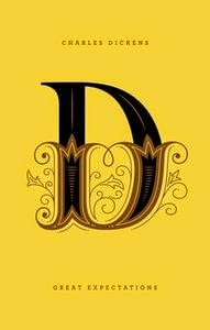
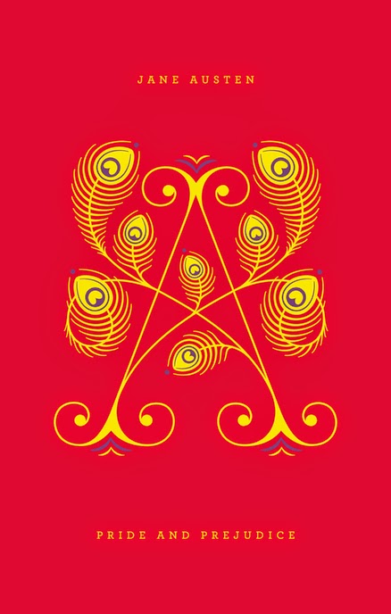 For Jane Eyre I found the Penguin Drop Cap series of hardcovers, which uses the author’s last initial in fancified, illustrated typeface. I do like that. It’s bold. You can see the cover Of Jane Eyre and the 25 others classics in the series at this link. Unfortunately I don’t need another copy of Jane Eyre. Or do I?
For Jane Eyre I found the Penguin Drop Cap series of hardcovers, which uses the author’s last initial in fancified, illustrated typeface. I do like that. It’s bold. You can see the cover Of Jane Eyre and the 25 others classics in the series at this link. Unfortunately I don’t need another copy of Jane Eyre. Or do I?Penguin makes a gimmick of it and suggests you check out your initial, and the author quote on the back of the book. Mine would be S for John Steinbeck’s Cannery Row. Too bad I’m not a Steinbeck fan.
My favorite design among these is the D for Dickens’ Great Expectations, which I’ve read twice, followed by the Q for Ellery Queen's The Greek Coffin Mystery, which I’ve never read. Can an elegant Q convince me?

If I had an e-book reader I could have started Villette this morning, since it's free on e-format at Amazon. In fact I do have a Kindle on my home computer and downloaded it, but I won't be schlepping that with me on a plane to New Jersey tomorrow. No, as usual when I'm about to embark on a trip, I'll be lugging a many-million page tome, this time Juliet Barker's family biography The Brontës. 1158 pages, not counting the introduction and middle bit of illustrations.


No comments:
Post a Comment